TAB
Tabcorp is a live sports, entertainment and racing company. They have sport and racing hubs at nearly every pub and club venue in Australia making Tab one of Australia’s most recognised brands and one of the world’s largest publicly listed wagering companies.
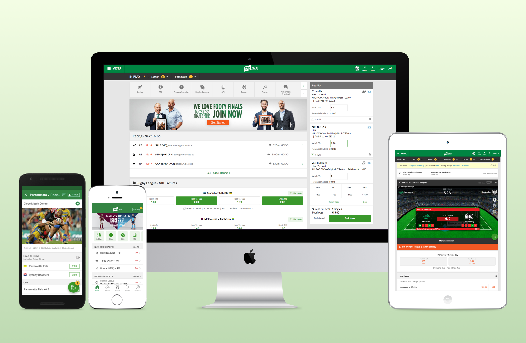
My main responsibilities at Tabcorp were to design the core user experience and interfaces of the TAB, Keno and SunBets products suite including native iOS & Android apps, iPad apps, and websites, we designed 8 new products from the ground up.
Role: Product Designer – UX/UI
Project: TAB Native Apps & Website Design
Year: 2015 – 2017
Overview
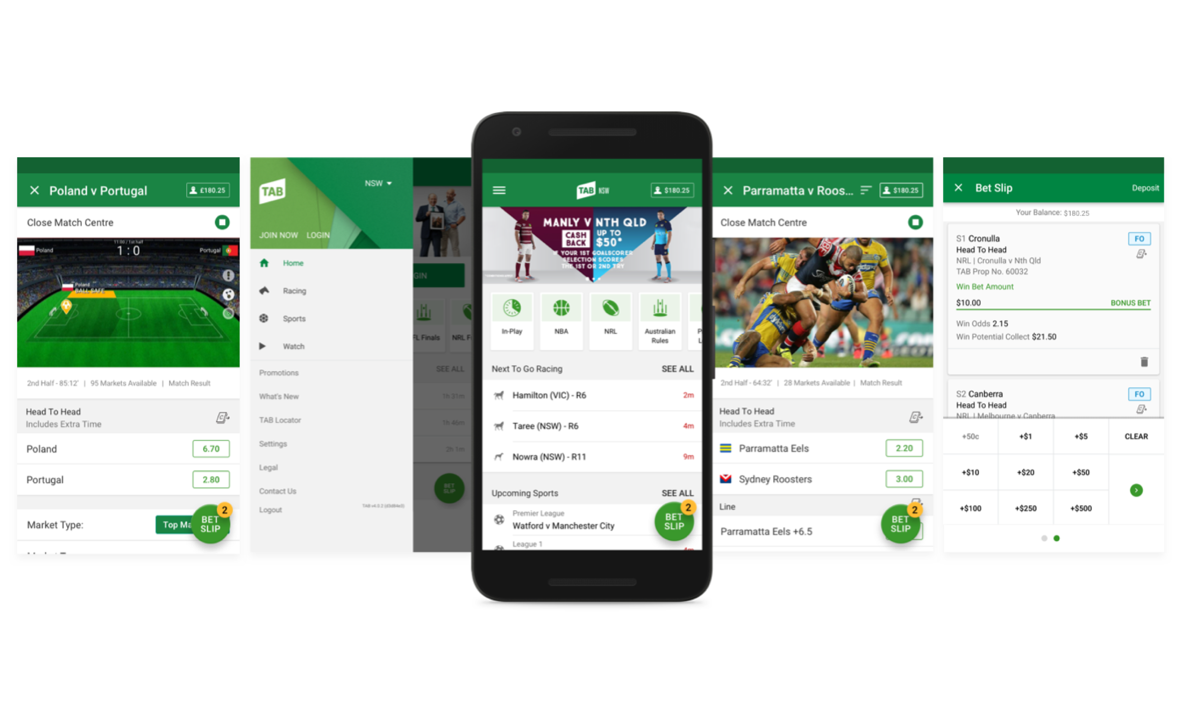
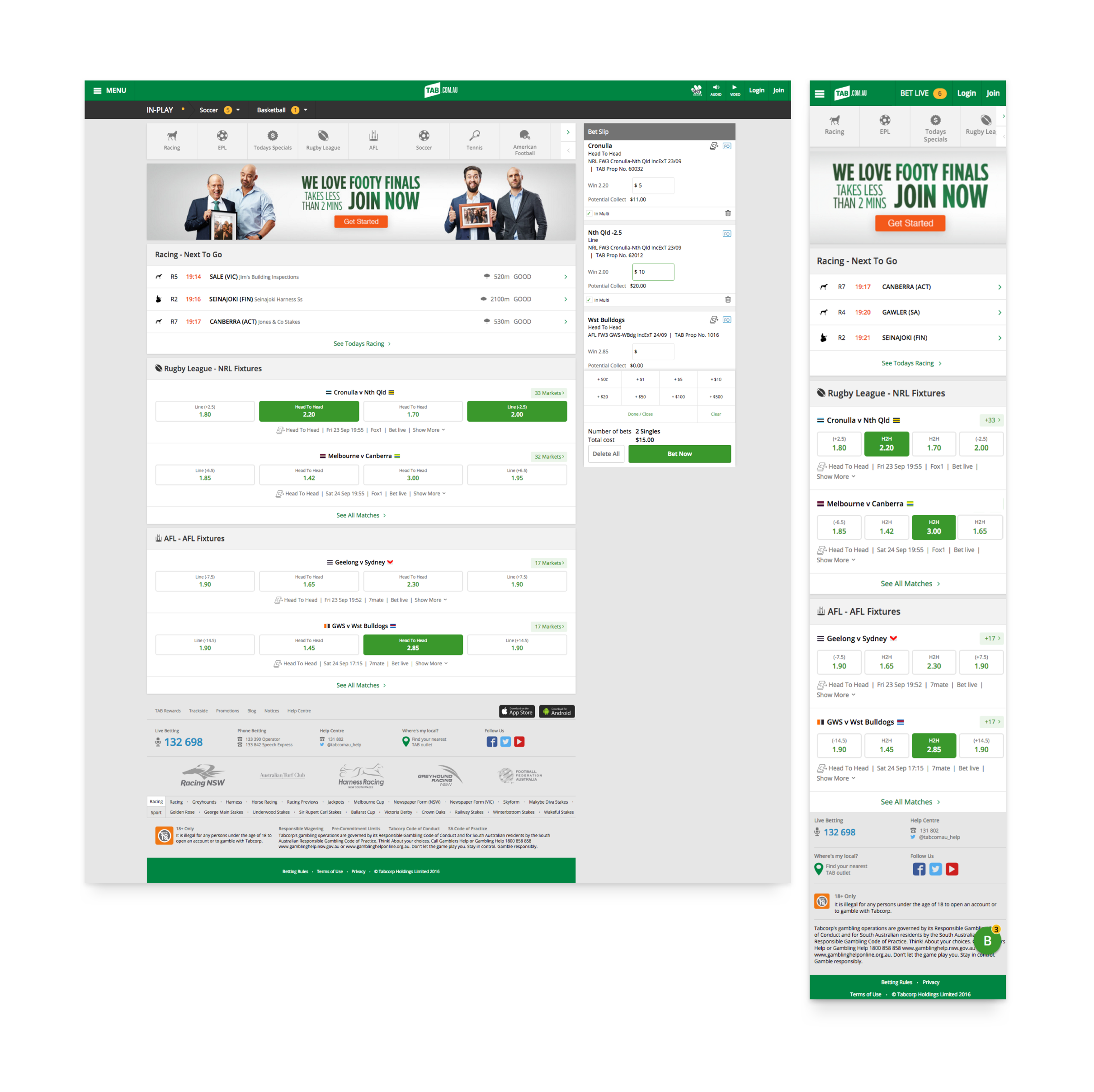
When I started at Tabcorp they began the process of bringing the design and development teams in-house. Previously the work was outsourced to creative agencies in Sydney. The website and apps needed a complete overhaul to create a great user experience for the TAB customers and stay relevant in a competitive market. We also needed consistency across the iOS, Android and web platforms. Working with a great user experience, interface and development team we redesigned the whole iOS, Android and website experience from the ground up.
The Design Process
Tabcorp’s design process was something the team and I worked on very hard to get right. The design team and business knew the value of simple design and a great user experience. To make sure we covered all the techniques to get high-quality results we created a design and research framework based on the Double diamond of design. We researched and experimented with different design tasks and methods and then created a list of tasks a designer could choose from depending on what stage of a project they were in. The Diamond also became a valuable reference for the business to see where we were at in the design process.
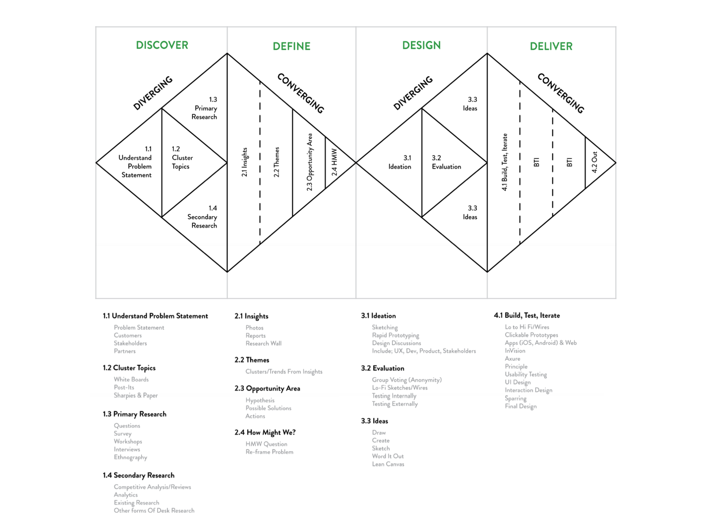
The Double Diamond of Design, showing the TAB design process.
Research & Workshops
During the TAB redesign, we conducted lots of primary and secondary research to understand our customers, what they wanted and how new features could work for them. By testing ideas early and often we could reduce the risk of building the wrong thing and wasting company resources. The other consideration was that the world of sports betting moves quickly so we needed to validate ideas rapidly and learn what worked to stay ahead of the competition.
Some examples of the qualitative & quantitative customer research we conducted were:
- Interviews
- Surveys
- Remote usability testing sessions
- Card sorts
- Lab usability testing
- Preference testing
- Benchmarking
- Competitor analysis
As the project progressed we needed to run many workshops with stakeholders, customers and the design team. These workshops helped us validate ideas, flesh out concepts, critique designs and get buy-in from the business. Some of the design workshops I facilitated were based on the book Sprint by Google and others on IDEO’s design kit. Each workshop was pre-constructed and thought out to achieve different outcomes.
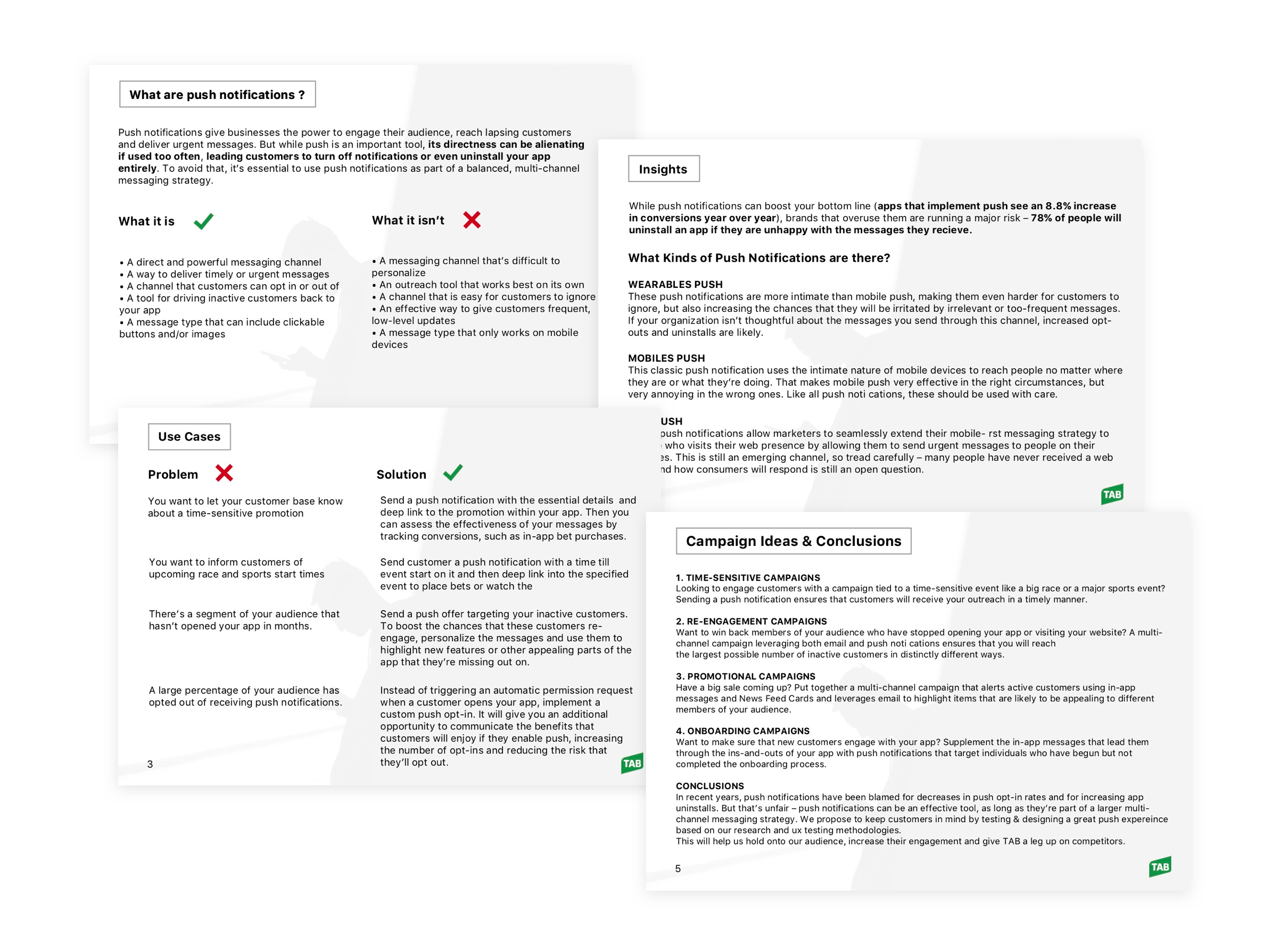
A few slides from a research recommendation deck.
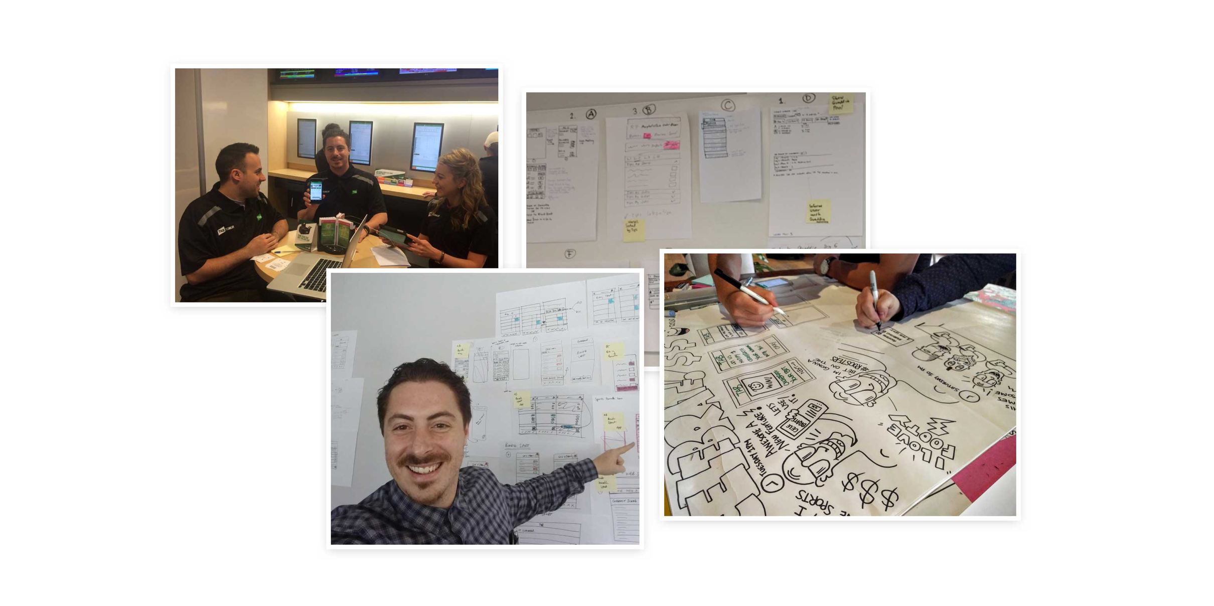
Workshop design and insights synthesis.
Sketching & Wireframes
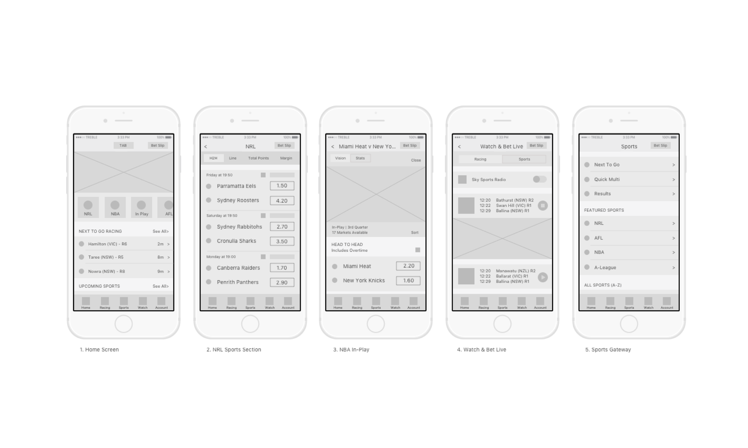
To create early-stage concepts and designs we began with sketching wireframes in sharpies and pencils on paper before moving onto simple digital versions made in Sketch. This was great to quickly create and discuss ideas with the team. Once we liked an idea we created clickable prototypes in InVision and tested with our users. If the idea worked I would then take it to the UI design stage. At the same time we would look at the complete user journey, the flows were important to show where all the touch points and screens were.
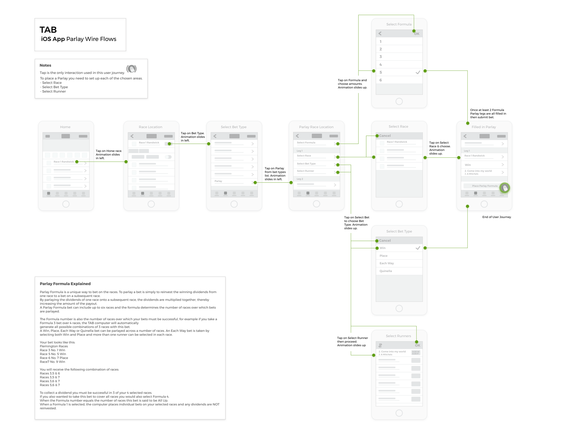
Wireflows showing a parlay bet type and the explanation.
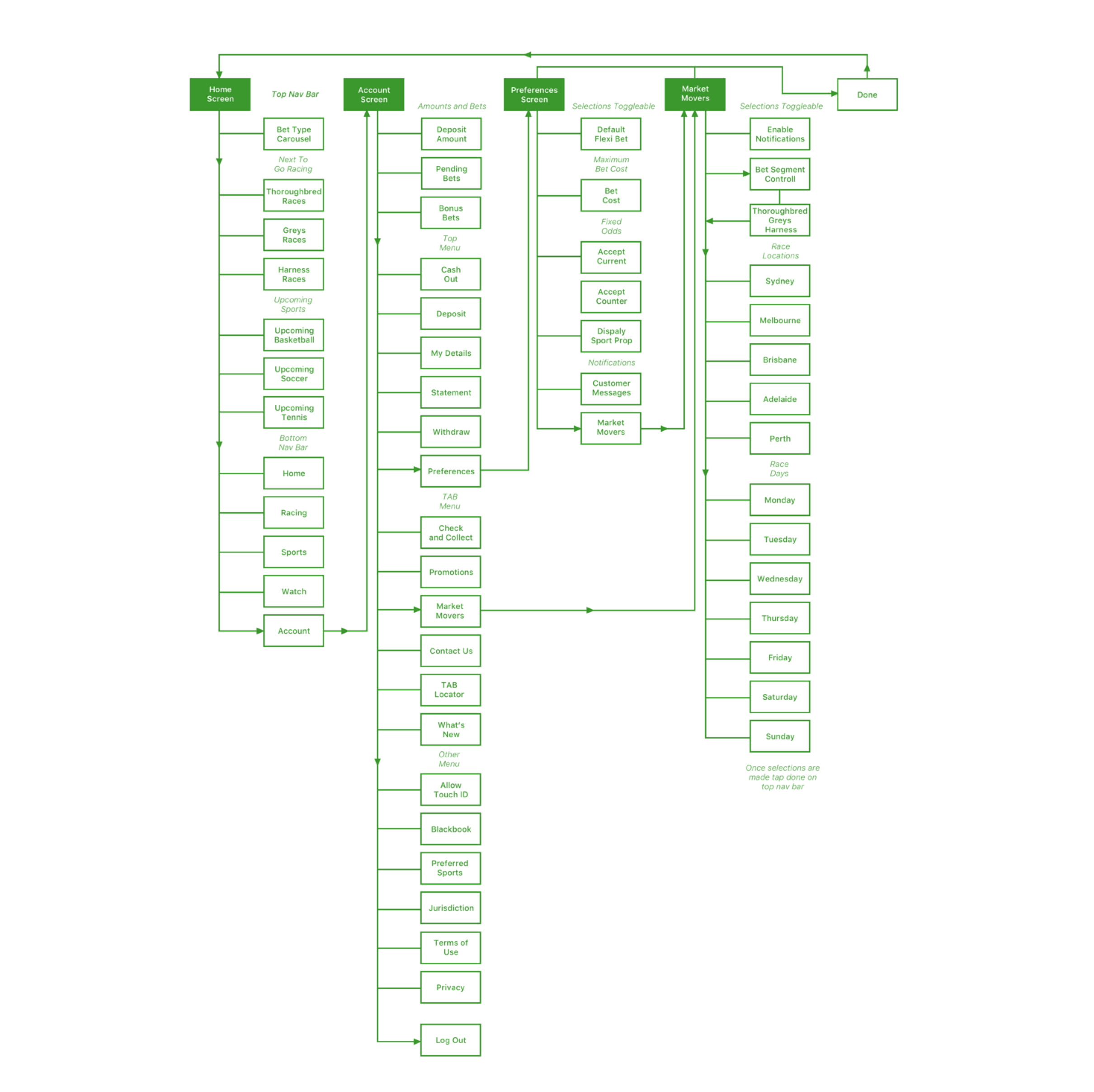
iOS app map for navigation items.
User Testing
At TAB we user tested every single design before it was released. To validate design we created clickable prototypes and tested them with our user base that we engaged through our TAB community and recruitment companies. InVision was our main prototyping tool and we were able to quickly upload Sketch designs into it and link them together to test with users on desktop or mobile devices.
For some situations, we used Principle for Mac and Axure to create the prototypes. Before testing, we would script out questions and scenarios for the customers to answer and complete. We recorded the sessions and kept them for further reference. Once the weekly testing was complete the researcher would collate findings look for patterns and present back to the design team who would then choose to update designs based on the feedback.
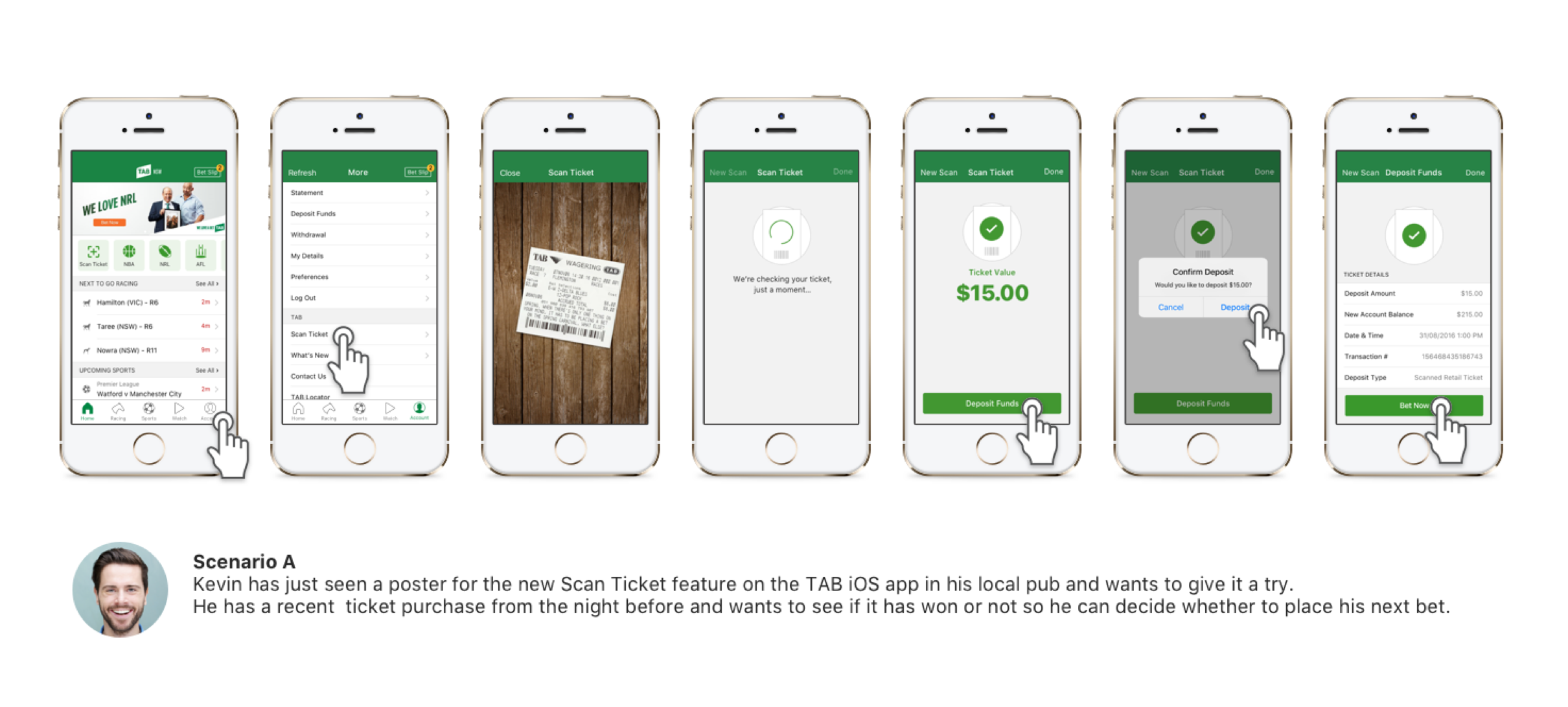
A scan ticket user flow mapped to a persona scenario.
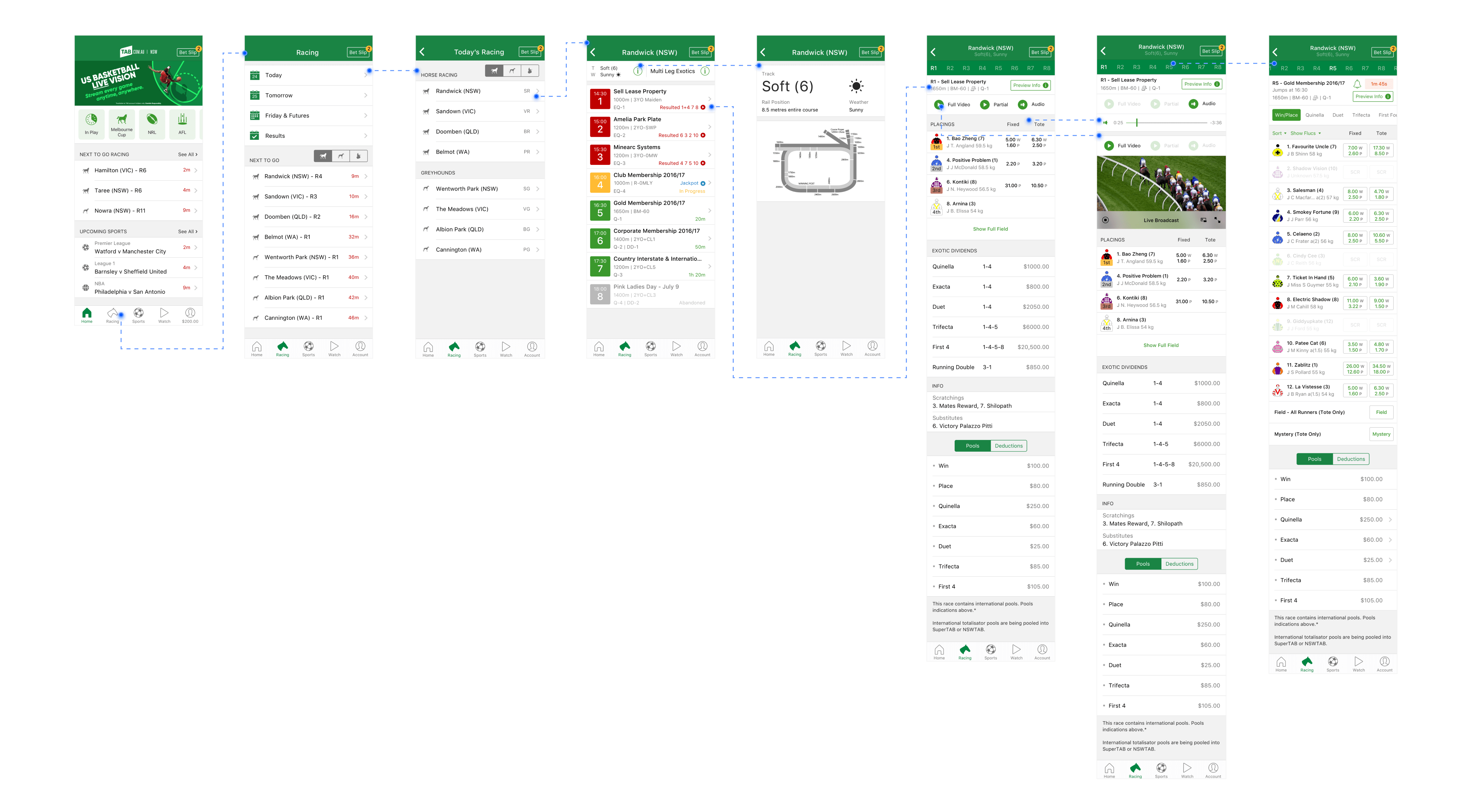
iOS race gateway flows with marked touchpoints.
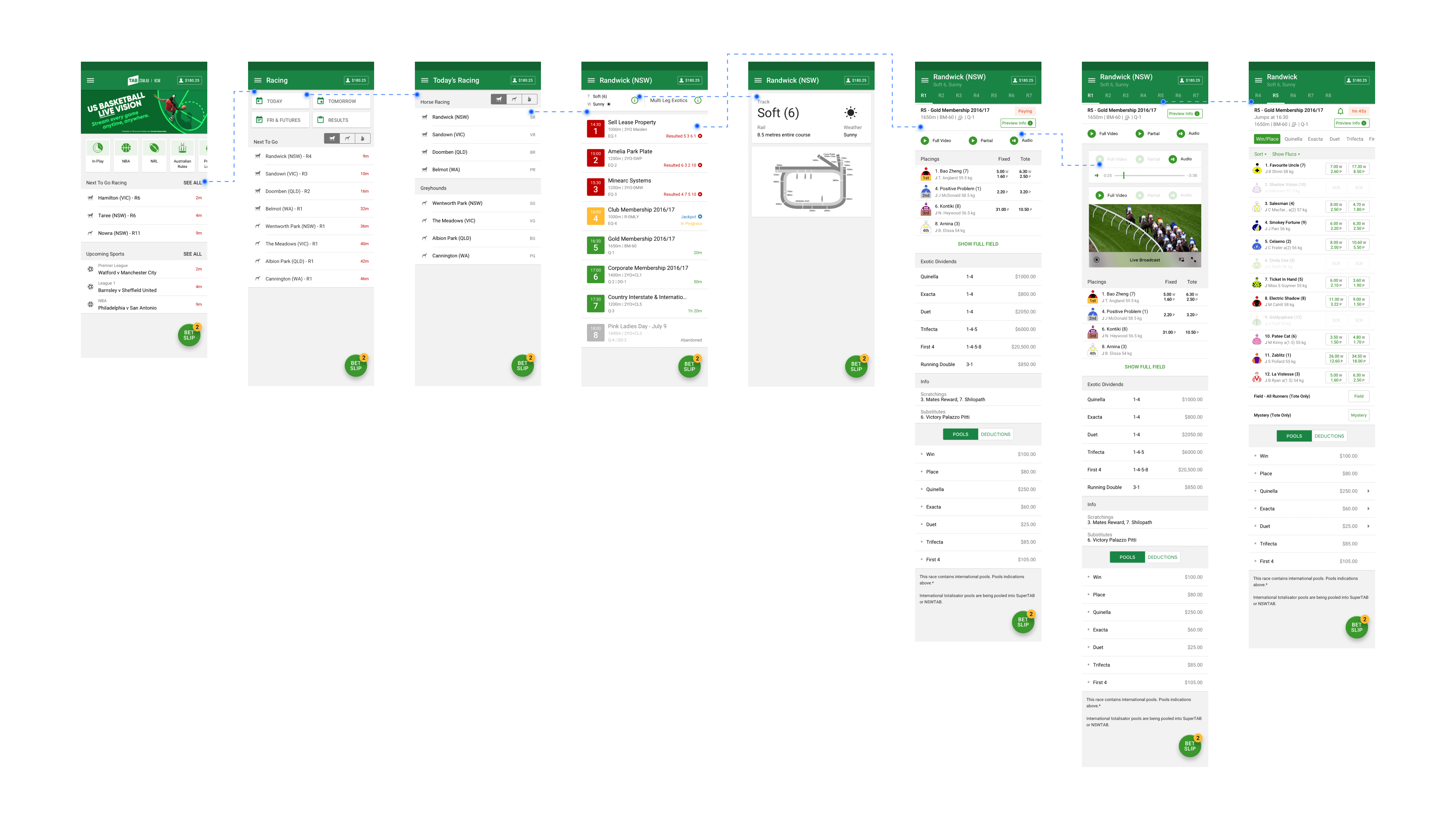
Android race gateway flows with marked touchpoints.
Styleguide & Interface Design
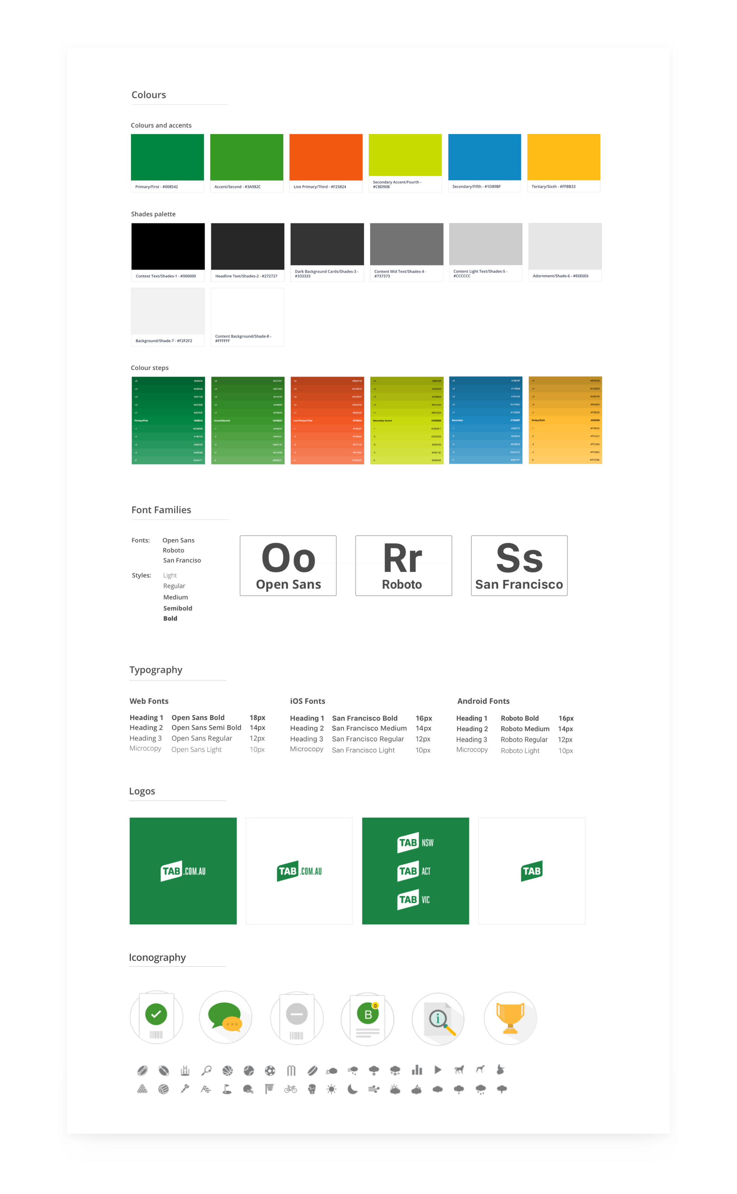
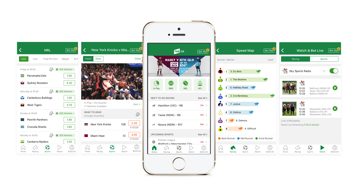
To begin with, we created the style guides of the apps and websites. This contained our colours, icon styles, grid structure, simple illustrations and typography. This document was essential to maintain consistency across all the platforms. As the apps were native we followed both Material and iOS design guidelines for them. The UI design tool was Sketch and we made great use of the Craft plugin and InVision integration to create quick prototypes for testing. We also used symbols, components and styles that Sketch offers to speed up our workflows.
Release Feedback
The new TAB apps and website, were well received by the customers. They were happy about the new functionality, clean minial ui design and simplified usability. Some key metrics were:
- We lifted the 2.5-star app store rating to 4.5-stars in 6 months.
- Tab digital saw a 24% lift in annual profit over a 2 year period.
- Customer engagement and retention at an all time high.
 “The app has improved considerably with the update, navigating the user interface is a breeze and finding the sport I’m after is so much easier and requires fewer steps. The race replay function has also improved so much. Good job Tab”
Jacko Wallace
“The update makes using the app a lot easier, and being able to watch the racing on the go makes life a lot easier!”
Matty B
© Julio Castellano
