Spaceship
Spaceship is an Australian financial services company whose mission is to enable you to invest in your future, so you can live the life you want to live. Spaceship has raised more than $40 million AUD to date from some of the world’s most renowned venture capitalists, including Horizons Ventures, AirTree Ventures, Sequoia Capital, and New Enterprise Associates.
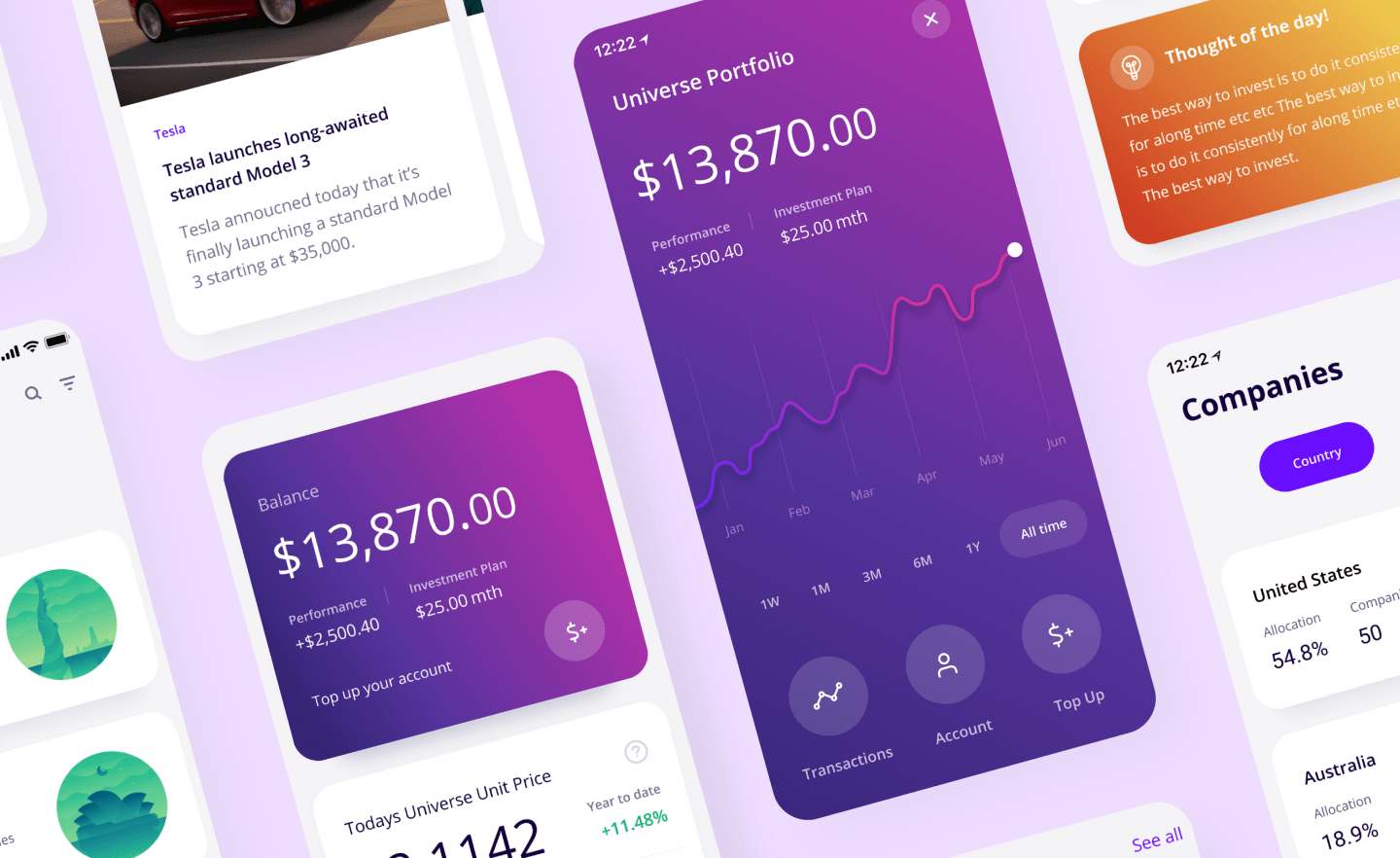
My job as the Lead Product Designer involved growing the design team, setting up the design and research processes, introducing UX and human-centred design into the company, creating the styleguide and design system aswell as complete redesign of the Spaceship Voyager App.
Role: Lead Product Designer
Project: Team Lead & App Redesign
Year: 2018 – 2019
Research
The first week I started at Spaceship I began reviewing the design processes and ways of working, I interviewed internal stakeholders about what was working well and what could be improved. We held team workshops and then created project goals, and delivery plans we agreed on working in an Agile, scrum dynamic between the product, design and development teams.
Next, I looked at user data from Google Analytics, App Store and Playstore reviews, Intercom and Fullstory, by synthesising all this information I could start to see patterns in what could be improved in the user experience. I did heuristic evaluations on the current app and started to form ideas and improvements to the existing experience before focusing on the redesign.
Looking interstate and internationally I identified direct and indirect competitors in the superannuation and portfolio investment spaces. To understand them deeply I did competitor teardowns and feature reviews, these techniques were extremely useful to understand why the apps were so popular, where they lacked and, it gave me plenty of features ideas to test out with our customer base. We also created customer proto-personas from the data we had these were then used by the marketing team and for the UX testing recruitment profiles.
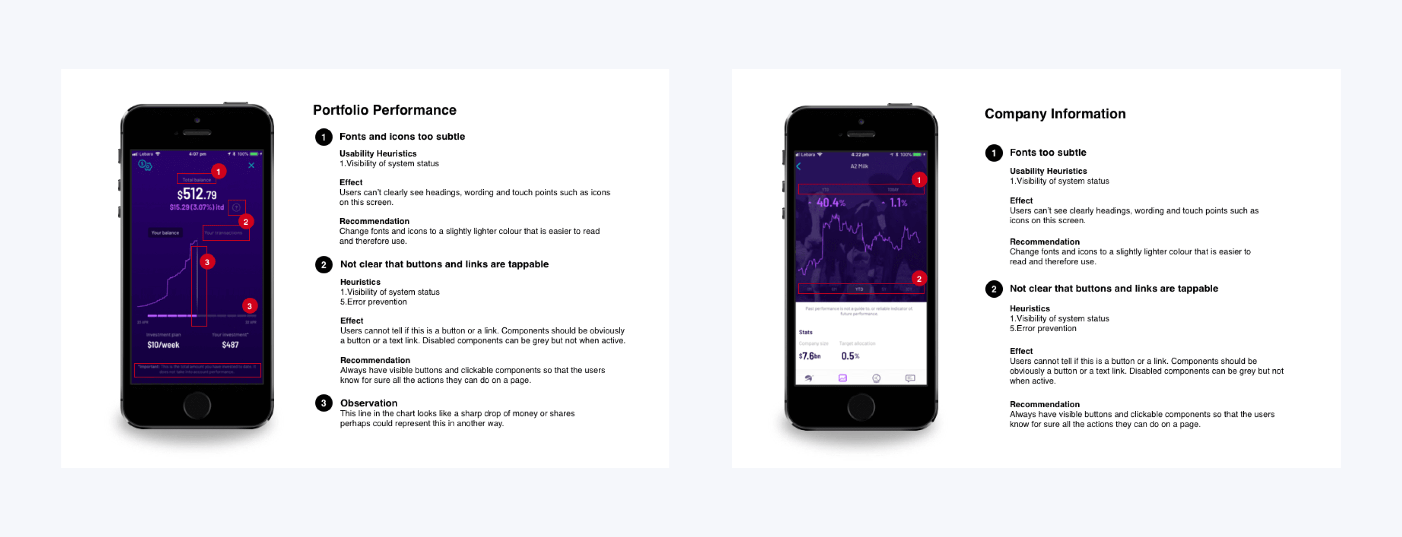
Two pages from the Heuristic Evaluation, pointing out the errors and recommended fixes.
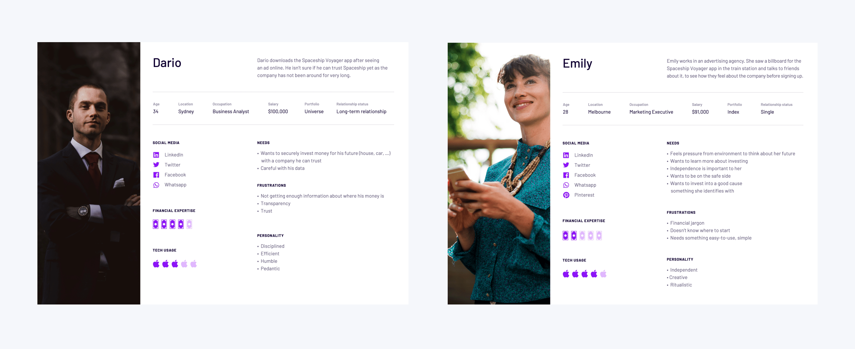
Two of the four proto-personas created for Spaceship.
The Design Process
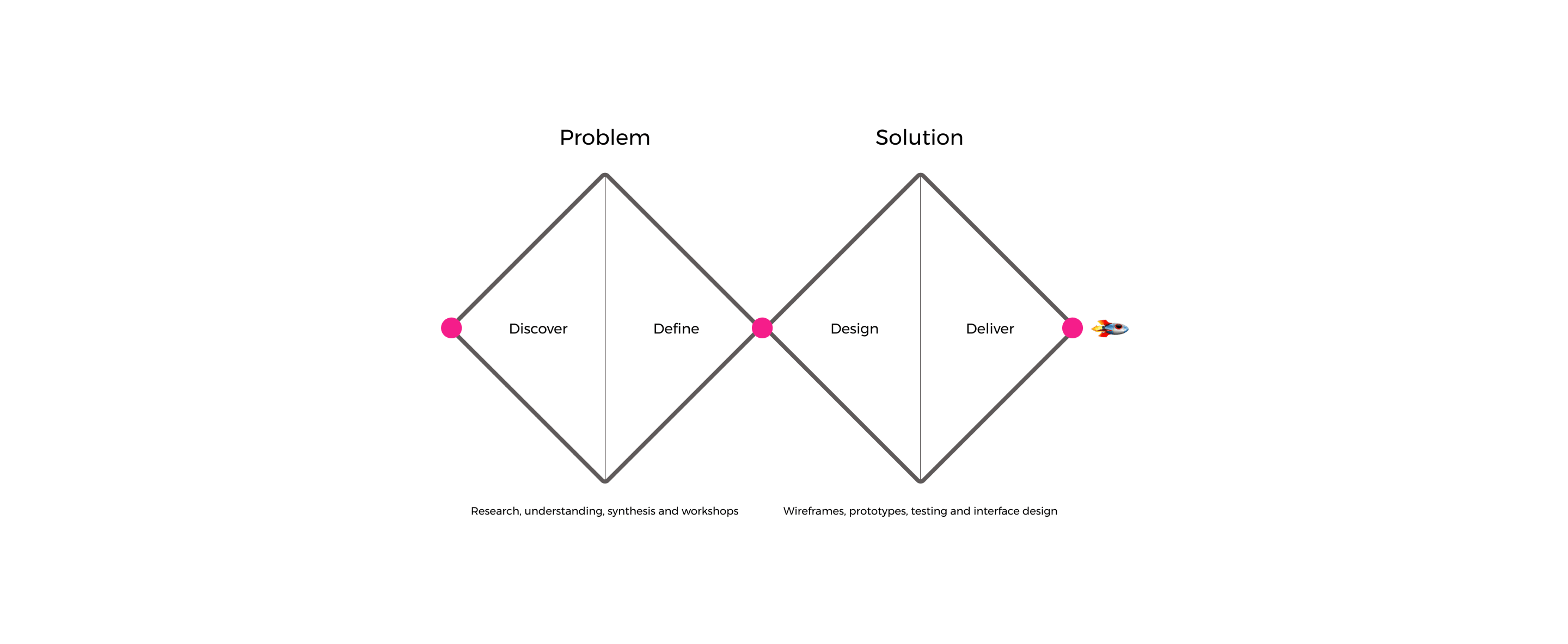
To create great digital products it is important to use a design process. For Spaceship I chose to use my favourite process, The Double Diamond of Design, this process is easy to understand and explain to everyone on the team, it clearly shows what stage the design is at and what’s up next, the basic idea is that each quadrant of each diamond represents divergent and convergent thinking, the first diamond is about discovery and the second diamond is about design and delivery, the process repeats until you get to a good well-tested product solution.
Design Workshops
To begin the design process, I facilitated design thinking workshops, these session were created from activities that I use from Google Design Sprints and Ideo’s Design Kit, I condensed down week long workshops into daily workshops by picking the methods that have the most perceived value to the group. A quick example and explanations of some of the activites:
- Lightning Presentations – Present your favourite app relevant to the project and explain why it is good and any limitations.
- Experience Mapping – Write down who solves the user need the best “eg buying shares” explain why the experience is good an any limitations.
- How Might We – Write down opportunities and pain points onto sticky notes, the present them to the group, we then affinity map them into patterns and dot vote.
- Crazy 8’s – Draw out 8 ideas onto a piece of folded paper then present them, the group then dot votes on best ideas.
- Solution Sketch – Draw out 8 ideas onto a piece of folded paper then present them, the group then dot votes on best ideas.
After this workshop we keep all the output and the winning ideas get the chance to be turned into wireframes and user-tested.

Some of the winning sketches from a design workshop.

Workshop insights synthesis.
Sketching & Wireframes
To create early-stage concepts and designs we began with sketching onto paper, this allowed us to move quickly and validate ideas without getting too caught up on one particular version. Once we had confirmed that a sketch concept could work we took it into Figma and created greyscale wireframes first, this was to test functionality first with our users and that right so they didn’t focus on the UI details like colours until later testing. We also looked at user flows and journeys for different sections of the app like onboarding, portfolio selection, account settings and dashboards.
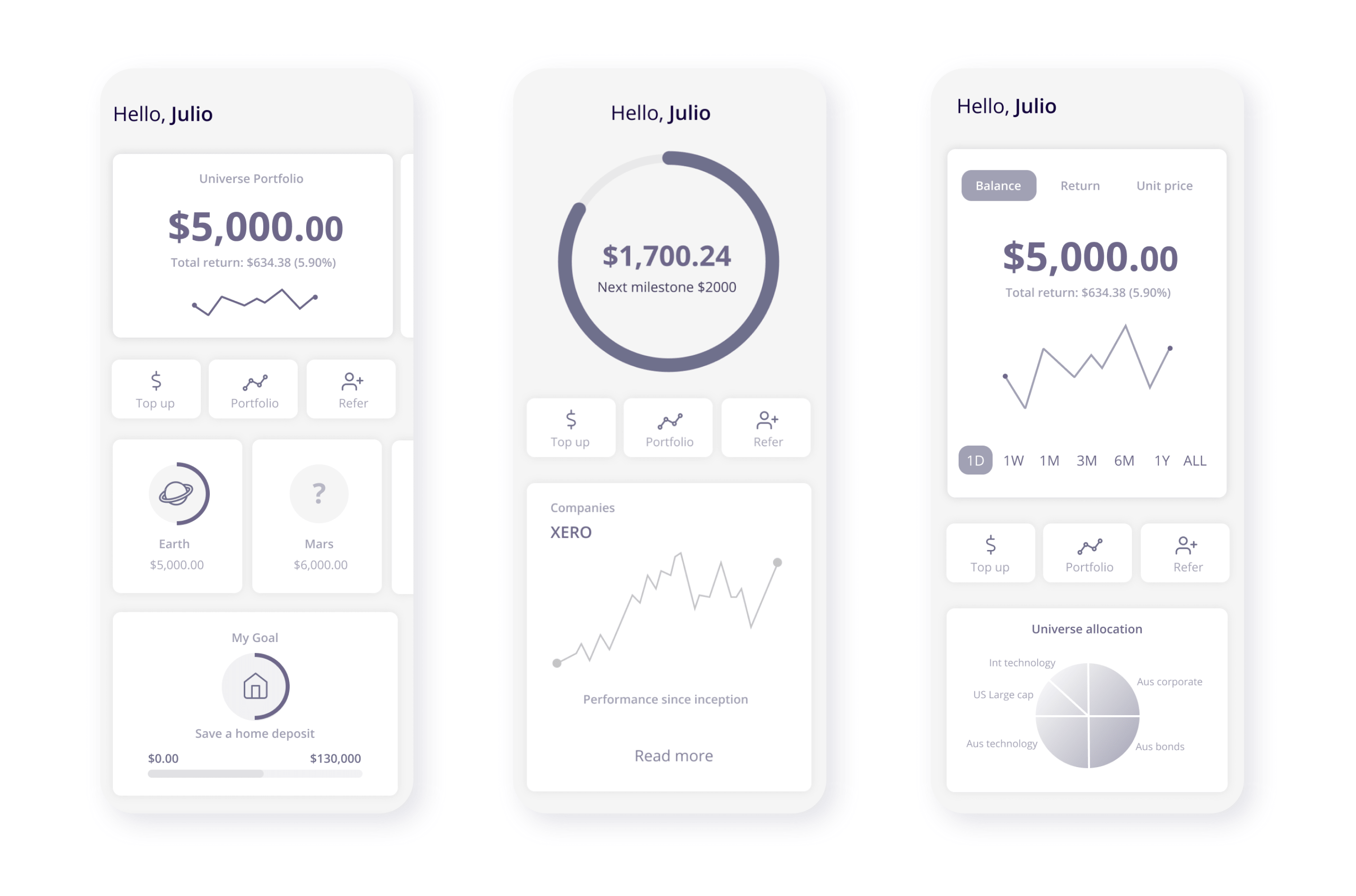
Variations of the home screen wireframes for user testing.
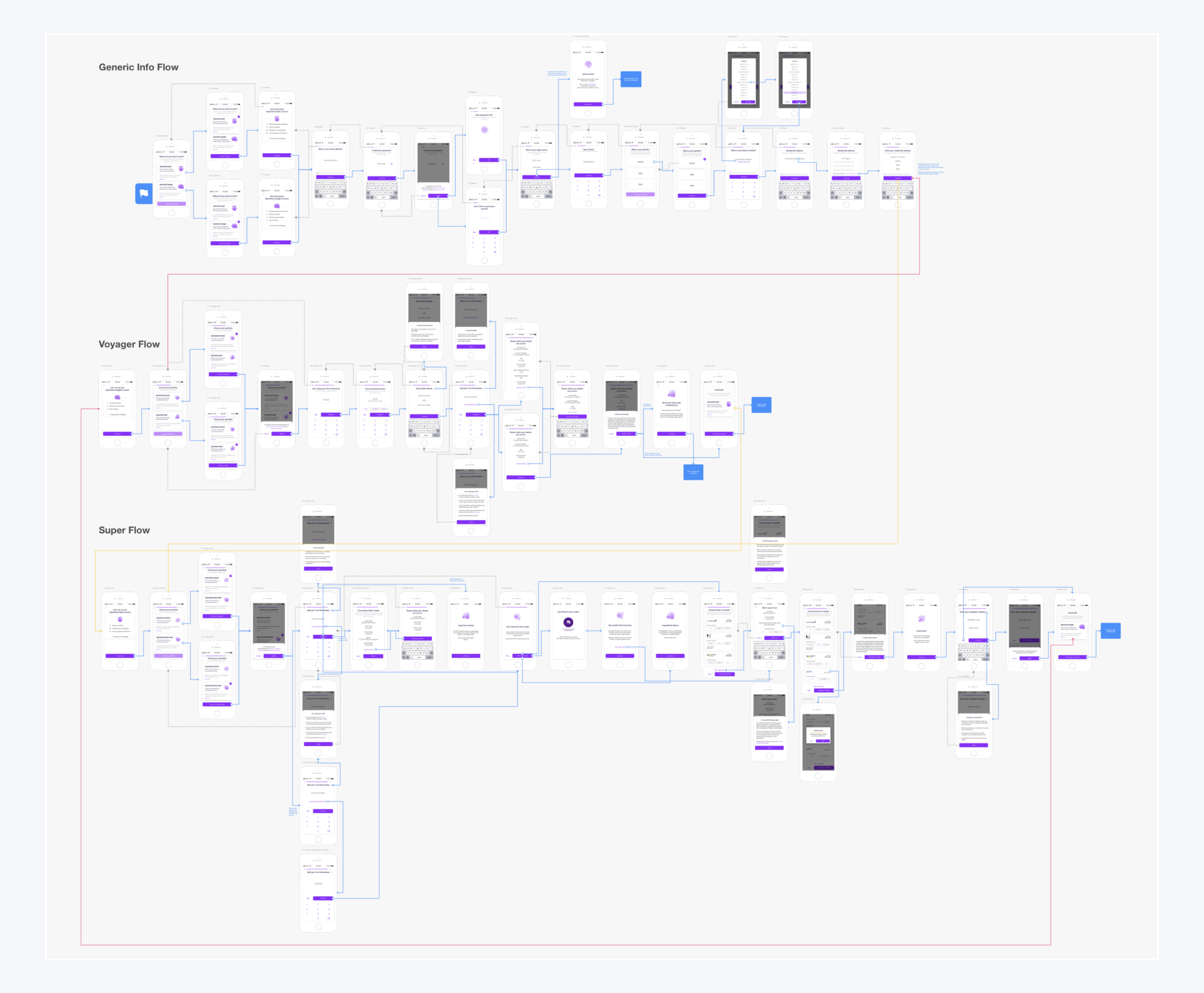
A complex user journey map showing a superannuation and investment sign up flow and how it all connects up.

An app sign up flow in Overflow the touchpoints are highlighted in blue.
User Testing
User testing early and often let us find out what was and was not working before we invested too much time and money into a design. We contacted a large group of our app customers and booked them in for 1 hour testing sessions at our labs every 2 weeks, with a minium of 5 people per test, our customers were very responsive and happy to come in and participate. This frequency ensured we were validating everything we worked on, I recorded all of the session in Loom and then synthesised all the feedback insights on Miro (Realtime board) and as an insights deck and shared with the team.
For the user testing sessions, I created moderation guides that had general customer profile questions, opening and closing questions and task based questions. I purposely gave the users tasks and then watched to see how they would complete them without helping them out along the way, this gave us realistic evidence of what people would do with the real app once it was released.
I also facilitated remote testing on Usability Hub, this platform gave us quantitative insights and we were able to test things like which colour schemes people preferred, what components were working better, which account sections made more sense. For the experiment tests we spoke with current app users, Australian non users and USA non users.
Top Up Your Account
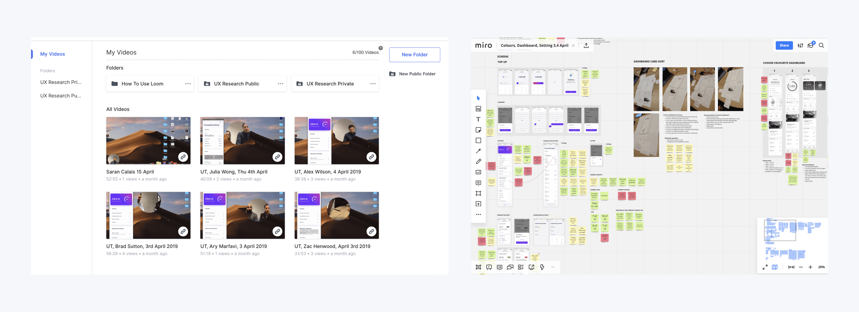
User testing videos on the left, presenting the user feedback in Miro on the right.
Email Statements

Two slides from a user testing insights deck.
Styleguide & Design System
To create the Spaceship design system, we first locked in our Styleguide containing the brand colours, typography, 8px grid spacing system, basic components and iconography. Once that was done we created our Component Library, this was the base for the whole app and by making everything into components we could easily come up with new ideas and quickly mock them up in Figma. For the app grid system we chose to use an 8px grid similar to Material Design, this worked well for the developers and gave us a clean and consistent look and feel.
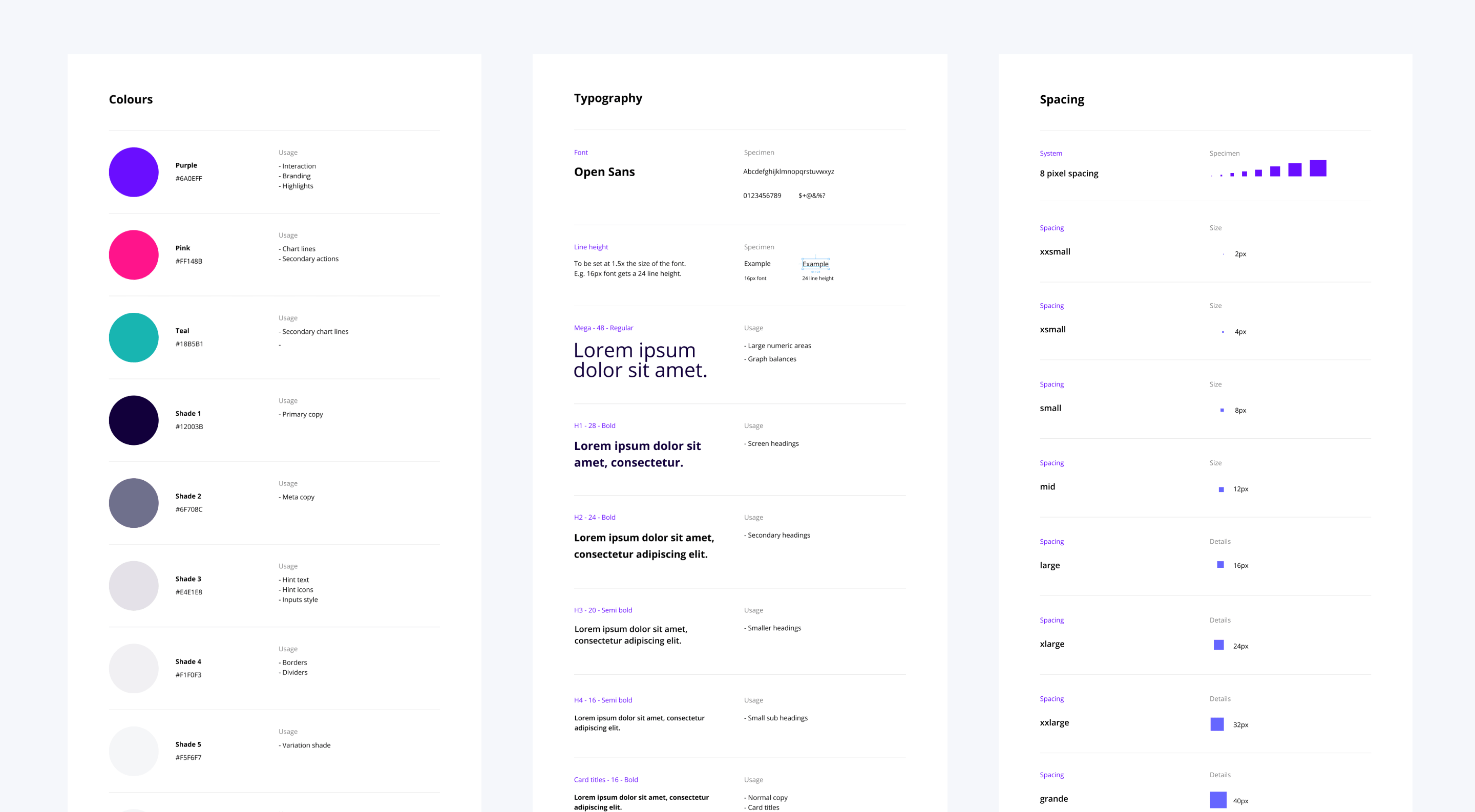
Styleguide containing, colours, spacing, typography & components.
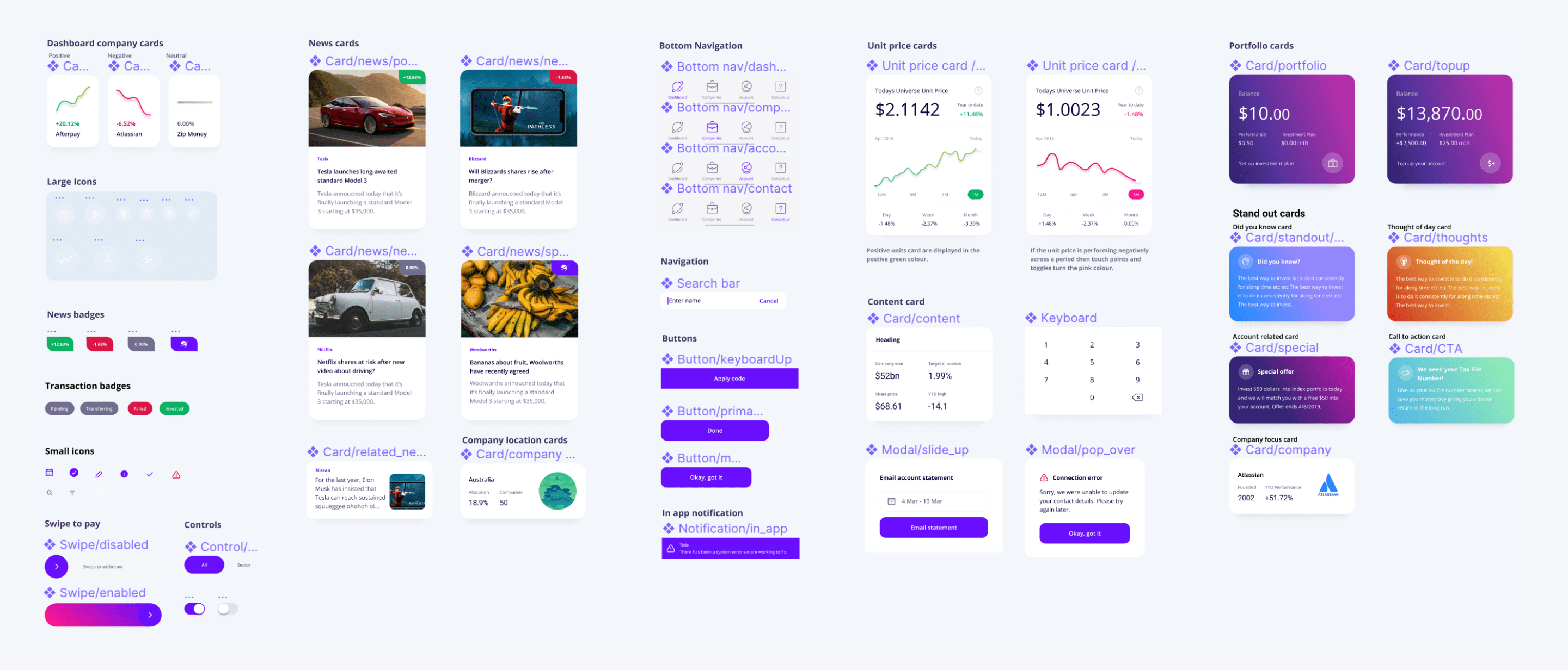
The app design system created in Figma.
Interface Design
After we had completed the process above we created the final pixel perfect UI designs for the developers to code up. We handed these over in Figma. From Figma, they could inspect and download any of the assets they needed. We worked closely with the dev team to ensure that everything was coded exactly the way we had created it. We created realistic animations in Principal for transitions between screens and micro-interactions.
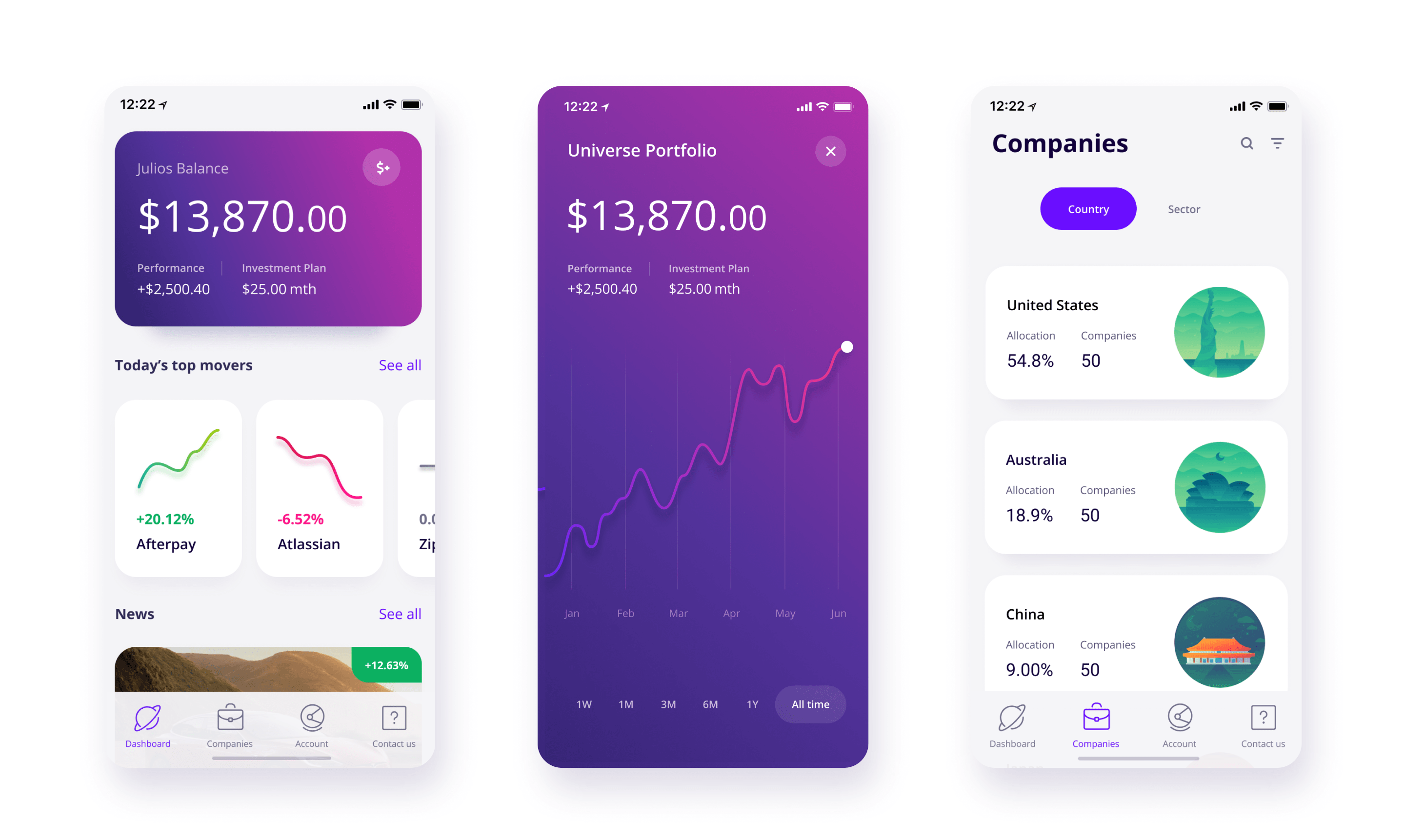

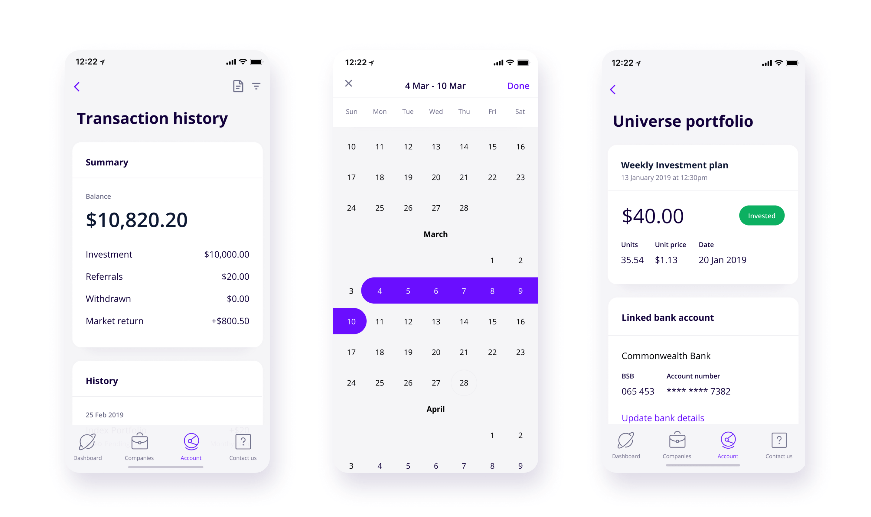
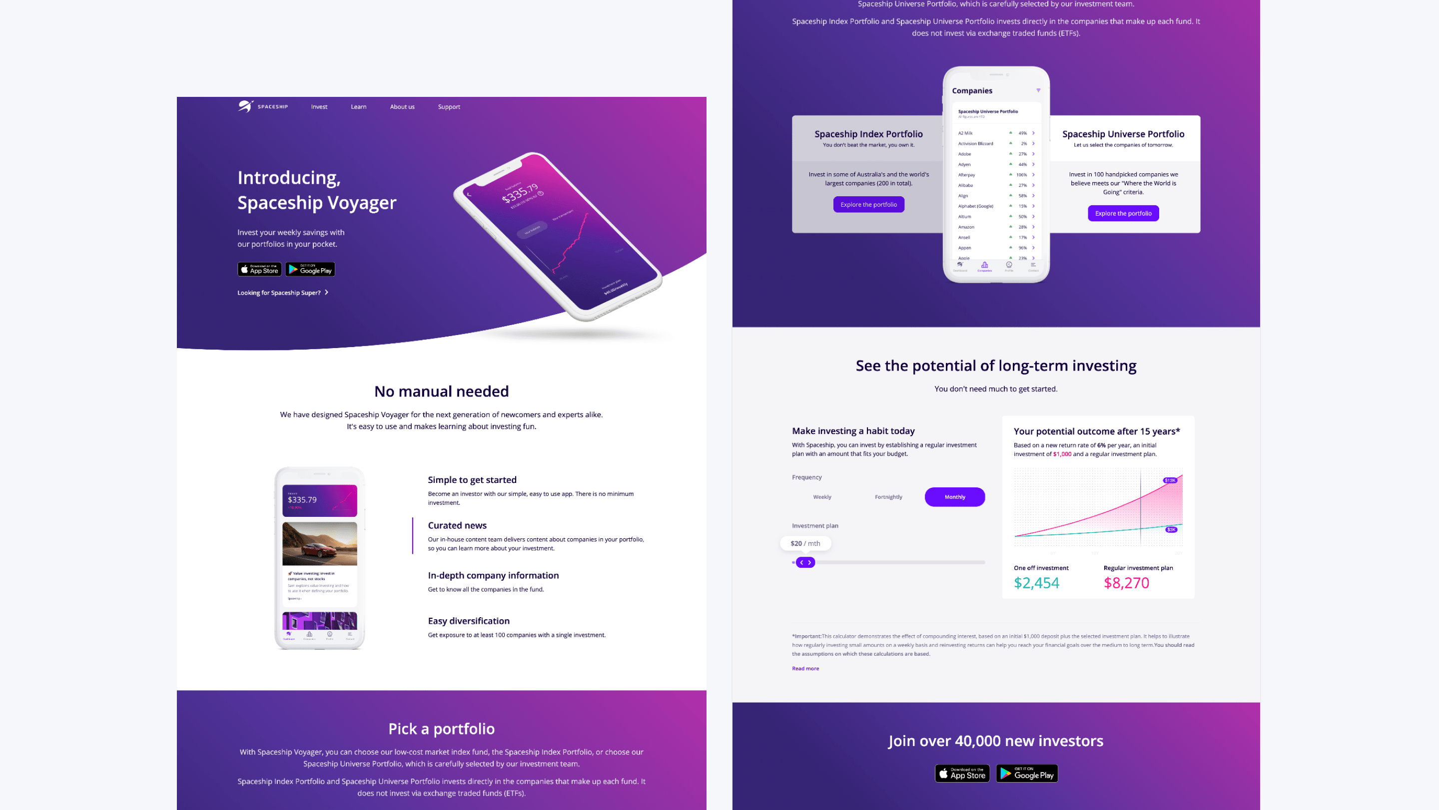
Release Feedback
When we released the new Spaceship voyager app, it was well received by the customers. They were happy about the new functionality, extra information and simple usability. Some key metrics were:
- We lifted the 3.2-star app store rating to 4.5-stars in 6 months.
- We grew the user base from 30,000 customers to over 50,000 active Spaceship Voyager customers.
- We reduced complaints and inquiries about account information.
Luke Grear
” It now shows how may units you have! You just have to look at your transaction history and now it shows finally!!”
Spaceship Facebook Group
👍
Excellent way to invest
” Really happy with the app growth of my investment over the last 12 months or so. Would highly recommend this to others, not only is it simple to use, but the fees are very low, the diversification is excellent, the investment returns are good and the app and related articles are beautifully written and easy to understand”
SuperSimon
⭐️⭐️⭐️⭐️⭐️
To the Moon!
” First off this review is not endorsed, I just admire great products built by people who want to help others. The company structure the low fees and great support of Spaceship Voyager is more than superb”
ZchSltmr
⭐️⭐️⭐️⭐️⭐️
Great low cost index fund
The good:
– very good low cost exposure to a broad based and diversified index
– app is easy to use
– nothing like this in Australia, a great disruptor to the bloated, lazy, and highly ethically dubious financial sector in Australia
– fees are just so very low, good work
Nrou5698
⭐️⭐️⭐️⭐️⭐️
© Julio Castellano